|
The Story of the Stone Soup Institute Logo
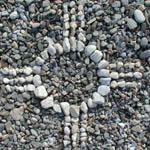
At an early board meeting of the Stone Soup Institute board members
were discussing a logo that would represent our school. Coleman Pulsifer
drew what is currently our logo and asked how we liked the concept
for a beginning. As subsequent meetings came along and the topic
was revisited we began to see that the symbolism was perfect just
as it was. Though it had no conscious symbolic meaning when he drew
it we realized that the circle was symbolic of a complete process;
the outer circle divided into four parts was the four seasons of
study, each of which is divided into three parts. The space within
the circle was symbolic of the great void from which inspiration
and creativity spring forth. It is also unencumbered enough to be
individually interpreted on as many levels as school participants
care to take it.
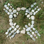
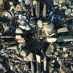
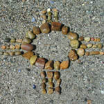
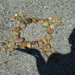
Rolf Hamacher (a European member of the board) laid
out the different "stone-designs" in Harpswell,
Maine, where the school is located.
|